Consider, Research and Discuss the
Conventions of Character, Archetype and Cliché in Illustrations
Illustrations, comics, political cartoons and
graphic novels use a variety of visual codes and sign systems to communicate
complex narratives and situations. These situations can range from economy and
minimalism, anthropomorphism and graphic symbolism. In this essay I will be
looking at different methods of describing and visualising character and
archetype and what the word ‘cliché’ means.
What
is Character and Archetype? “Central story patterns of
archetypes stretching back to the earliest myths and folk tales underline each
character role. Like members of an Olympian pantheon or Tarot deck, characters
all have countless aspects and hybrids of archetypes abound. The classic or
mythic hero, the one who saves the day, fights the monsters and restores order
from chaos- is the most recognizable archetype, as the heroes quest is present
across all human cultures.” [1] Character and archetypes are a recurring
character type that appears in all literature. Comic books and graphic novels
are no exception to these patterns and actually have an advantage compared to
novels or short stories. They are able to enhance and tell stories through
visual means, often without any text or speech bubbles. “Comics are a medium of
action rather than words, and it has been said that you can get a better
understanding of a character’s personality by paying attention to their actions
rather than their words.” [2] These archetypes can range from the hero,
villain, antihero, the boss, the geek, the trickster, the foil and the shepherd
and can also be defined by clothing and setting. “Original
pattern of which all other similar persons, objects, or concepts are derived,
copied, modelled, or emulated.”[3]

The most popular type of comic books
is unquestionably the superhero comic. Superhero comics started arguably around
1933 with the arrival of Superman and the start of the golden age of comics,
and set the anchors for all archetypes that followed. Superman was a genuine
hero down to his core and this was amplified by his overall appearance. He’s
tall, handsome and has a huge physique. A superhero needs a variety of
different strengths, most obviously being physical power. He has to be able to
beat the bad guys in a fight and save the good guys from a disaster. Superman’s
appearance suggests straight away that he fits the bill. As you can see in the
first image here, he has a warm, welcoming smile on his face suggesting to the
reader that he’s the good guy, he is someone you can trust and someone who will
lend a helping hand (which he does time and time again). He has been modelled
as a classic hero archetype.

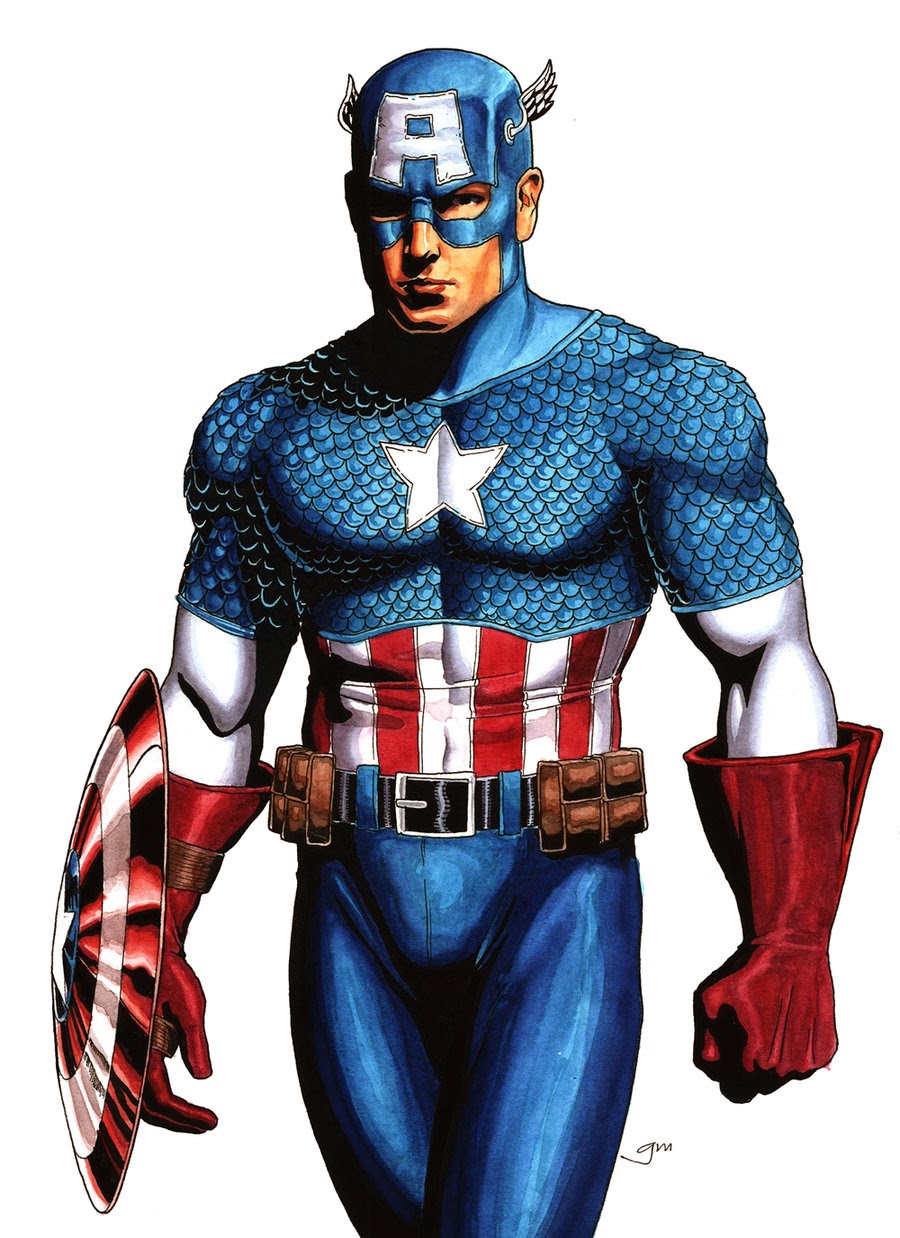
Captain America is another classic hero trope. Unlike Superman,
who was born with all the power he possesses, Steve Rogers gained his powers
through a scientific experiment. During the experiment his doctor was shot and
killed which led Rogers to have a guiding moral compass and use his powers for
good. But you don’t need to know the story to realise that he is the “good
guy”, his costume is probably the biggest giveaway. Its based clearly on the
American flag, the star spangled banner. “Iconographically, almost all
superheroes are good looking and muscular, and wear costumes that emphasize the
fact.” [4] The United States of America is a country who first and foremost
pride them selves on freedom and Captain America was created during World War
II, so its obvious as to why they choose the stars and stripes. His costume is
a symbol to the American people for hope and perseverance. He does share
similar attributes to Superman though; he’s tall, handsome and very muscular
with a strong jaw line. Another classic superhero.
There are literally hundreds of superheroes in many different
comic strips and graphic novels, mostly modified versions of the classic hero
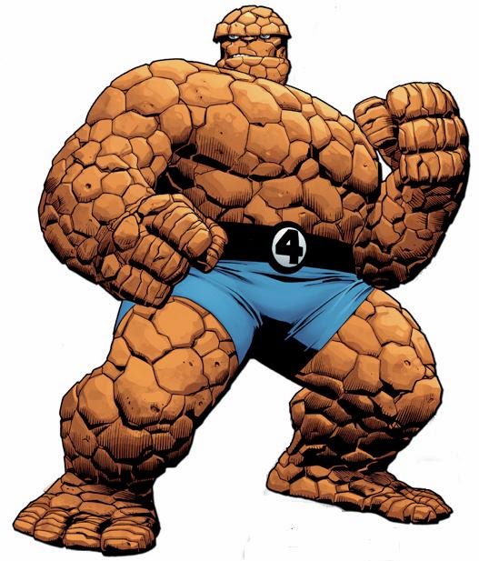
archetype, but not all look like Superman and Steve Rogers. “There are obvious
exceptions – Ben Grimm of the Fantastic Four is not any less a superhero for
looking like a pile of orange rocks”[5] If an idea or expression is overused it
runs the risk of

becoming a cliché, and also a parody of itself. Ben Grimm, or
The Thing’s, appearance does not conform to the traditional look of a superhero;
he doesn’t even look like a normal human being. Ben Grimm’s appearance was made
to break the norm, show that heroes don’t have to be good looking and handsome.
He does however still possess’ superhuman strength, and is actually bigger then
Clark Kent or Steve Rogers who, even though they have muscle, are quite slender
and lean. The other main difference from the first two is The Thing cannot
change his body. He bares the curse of having to constantly look like a pile of
rocks. So even though he still fights the good fight and protects the innocent,
his appearance does not fall into the category of a cliché. He breaks the
mould.

A question that is debated in depth
and fairly often is, ‘why are superheroes good?’ It’s not enough to just say
these are the good guys and they will do good things, their needs to be some
underline reason and have an existential reason for the characters actions. The
struggle between good and evil tends to take the form of violent or inner
struggle, because that is the way that, since the beginning, comics have chosen
to stylize moral contention. “The question as to whether people love justice,
or goodness, for its own sake or merely because they realize that if they are
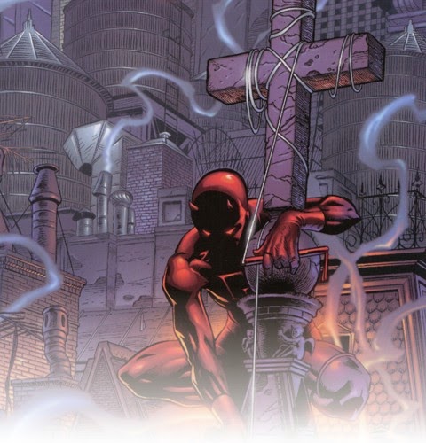
unjust, or immoral, they will suffer negative consequences.” [6] Daredevil is a
blind Marvel superhero that has the nickname ‘the Man Without Fear’. He has
also been portrayed as a member of the Catholic Church, although a troubled and
often conflicted one. This is relevant to what he does as a costumed crime
fighter because it’s what guides him and gives him moral principals. But is
religious faith a form of strength or weakness? Is it help or a hindrance? With
all the powers that these superheroes posses, they can do so much good but
equally do so much harm and destruction. Matt Murdock’s faith influences his
attitudes and his actions, and is a source of inner strength and guidance. “Critics
of the genre often assume, wrongly, that it pays no attention to the ethical
issue at its core, whereas in fact it is obsessed with it almost to the point
of cliché” [7] When superhero genre first started to appear that might have
been the case, but Daredevil doesn’t comply to that cliché and the ethical
issues are definitely a driving force for the character.
“The
antihero is arguably a melding of the classic hero pattern with a more cynical
modern perception of human complexity and weakness.”[8]. In 1986 Alan Moore and artist Dave Gibbons published a 12-issue
mini-series called “Watchmen” which was thought of, as Roz Kaveney puts it, the
superhero comic that deconstructed the whole idea and made superhero comics
redundant thereafter. [9] Moore exemplifies increasingly common character
types, granting them a sense of nobility to clearly conflicted protagonists.
Moore didn’t want to create just another superhero ensemble book feeling they were becoming conventional and clichéd.

One way that watchmen forces us to rethink
the superhero is by portraying several costumed crime-fighters as psychologically
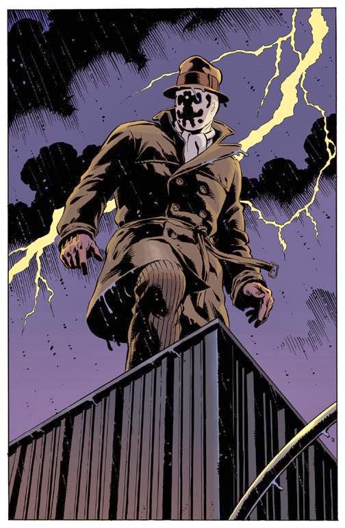
troubled. One of the protagonists in Watchmen, Rorschach, is a psychologically maladjusted
antihero who had been traumatized in his childhood. Now because of this, Walter
Kovacs (Rorschach) chooses to don an inkblot mask that constantly changes and
moves around depending on his mood. Keeping in tone with the comics,
Rorschach’s chosen costume is this noir, 1930’s looking suit instead of a
clichéd, out-dated superhero costume with a cape. This immediately
distinguishes him from his colleagues and predecessors, who all wear costumes
that amplify their name and personalities, such as ‘Nite Owl’ who’s costume is
based on the look of an owl. Another good example of the antihero from Watchmen
is the character, ‘The Comedian’. This
is another superhero that is thuggish and sadistic. He has a twisted sense of
humour, he is neurotic, and has little regard for social conventions or human
life. Despite all of this, he is depicted as a patriotic symbol and is not the
villain. The villain of ‘Watchman’ is in fact the supposed superhero – and
Watchmen member – Ozymandias.
The
character of the villain (or antagonist) is iconically an evil man or woman who
has a grand master plan for personal gain, and is usually foiled by the
protagonist. Many of the opponents of the superheroes are as powerful as the
hero but lack a moral compass or have specifically chosen evil. Protagonists
have a moral code that usually states to do no harm, while the antagonists
simply disregard any code such as this. Antagonists are usually as strong or
stronger than the hero. They would also have their own costume or suit that
would mirror the heroes in some way or it would be a way to showcase a part of
their characteristics. A quick example of this would be Lex Luthor from the
Superman comic, who wears a suit to give off a sense of authority, or the Green
Goblin from the Spiderman comics who’s costume is designed to give the look of
a crazed man gone over the edge. Ozymandias once again breaks the tired old
cliché about super villains. He was a superhero but when the Watchmen hung up
their capes and cowls, he turned businessman, entrepreneur. This leads to Ozymandias
creating and successfully executing an elaborate plan to stop the annihilation
of all human life, which leads to all nations at war to a peaceful
collaboration against a new common enemy which is an alien invasion, set up by
Ozymandias himself. Veidt, his real name, is the cause of three million deaths
when his plan succeeds. “The way of thinking employed by Ozymandias, the deaths
of even many more people could be justified in the name of saving billions of
other lives and ending war between nations.” [10] This brings up the question;
does the end justify the means? Aeon J. Skoble says that, his actions are to
bring about a stronger, more loving world, which he is convinced, is the right
thing to do, and his actions are tremendously effective, but is irrational and
insane? And is it necessary? [11] Has this man become a monster or is he just a
misunderstood hero?

One
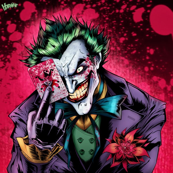
of the more recognised villains in the comic book universe would be The Joker,
created by Bob Kane and Jerry Robinson in 1940 and was the nemesis for the
superhero/vigilante, Batman. The Joker is a sadistic, psychopathic man who breaks
the normal conventions of the villain archetype and has been a major influence
on characters in the last century. What separates him from traditional villains
is that he doesn’t have any goals for personal gain like money or power, have
any abnormal physical strength, or wears a costume that would in some way
protect him. He’s just sadistic and is obsessed with murder and suffering. He
is a worthy opponent for Batman because he will always loose in a physical
embrace but can triumph when it comes to inflicting mental distress on Bruce
Wayne. He wears a cheap looking purple suit which enforces his personality of
being a crazed mad man because its not a suit of armour, its there for comedic
relief and to emphasize the fact.
Another type of
archetype is the Foil. This is a character that is usually written to highlight
another characters traits, usually the protagonists. A good example of this was
would be Asterix and Obelix. Asterix is the protagonist while Obelix is the
foil and in some ways his sidekick. Another example of this, in the comic
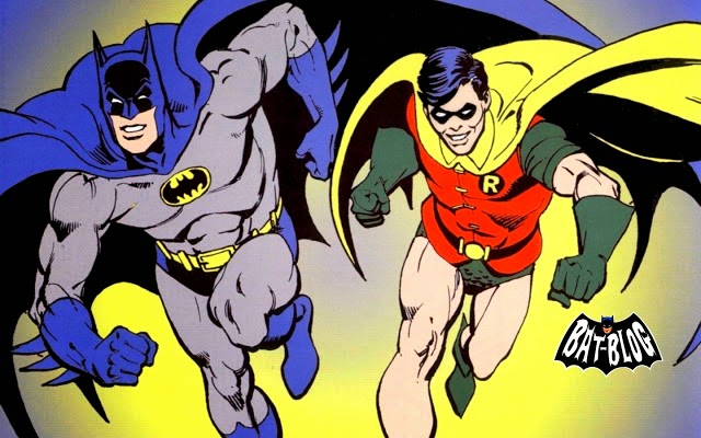
universe, would be Batman and Robin. Dick Grayson is Bruce Wayne’s sidekick, or
foil. Bob Kane created batman in May 1939 and Robin was first featured just
over a year later in April 1940. The choice of Batman’s costume was a simple
matter of choosing something that would scare the cowardly superstitious
criminals, and strike fear into his enemies, so Kane went with a very dark and
brooding costume, that turned into something more, a symbol. Grayson’s costume
was ultimately very different from Wayne’s, probably because he was at the time
still a young boy, but also because the heroic outlaw Robin Hood was an
inspiration for the character. The image I

have chosen here depicts the two
characters together and the differences are obvious. The artist, Jerry
Robinson, was able to capture the youthfulness of Dick Grayson by giving him a
smaller physique, while still making him believable as a caped crusader by
making him a little leaner. If he were as big as Batman then the readers
wouldn’t buy the fact that he’s still a boy, not a strong, tall man.
 Another
way comic book writers and artists were able to break the clichés of written
characters and archetypes were the way they wrote female characters. The
‘Golden Age of Comics’ was going on at the same time as the Second World War.
Men had gone overseas to serve their country and the women were left to take
care of their homes and family. In the face of feminist progression, more women
in leading and heroic roles were needed as a way for women to feel empowered in
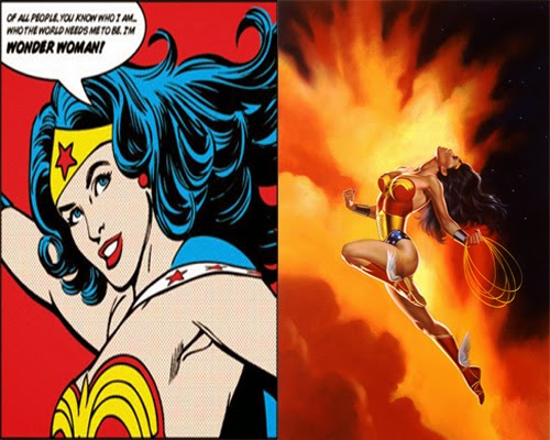
a very male dominated world. One of the first notable female superheroes is the
DC character Wonder Woman, first appearing in December 1941. Like all
superheroes at the time, Wonder Woman fought for truth, justice and peace and
was soon considered as a feminist icon. Like Marvel’s big name character
Captain America, she dons a star spangled costume, which involves a short skirt
showing off just how toned she is and how physically strong she is. The comic
showed that it wasn’t just men who could be strong and powerful but women could
too and they needed to be heard. Eventually, like all comic book series’,
different writers came in and inevitably change certain characteristics of
Diana Prince. They wrote storylines that involved more domestic issues and
romance, and the look of the character herself was more hyper sexualized. This
caused some controversy because Wonder Woman was meant to empower women, not
play to male orientated fantasies.
With the rise and popularity of Wonder
Woman more and more female superheroes were being created. This counterbalanced
the playing field in an otherwise male orientated universe. Marvel was
particularly strict about writing and drawing heroin’s and one comic book
series that stands out is the X-Men. A team up comic featuring the likes of
Rouge, Scarlet Which, Jean Grey and Storm to name but a few. These characters
were all written in some way as psychologically damaged with, to a certain
degree, trust issues. Ororo Munroe (Storm) is a black superhero that is
intelligent, loyal and very powerful, she is able to fly and control the
weather. She lives in a world where the human population hate mutants yet she
still fights for the good of humanity. This makes her very noble and a true
hero. The physical appearance of Storm is very toned and muscular yet is
covered up by a white costume and with a cape that also looks like wings. So
not only is she not over sexualised, she also wears a costume that has a function.
In
conclusion, I feel that the world of comic books and graphic novels is a broad
one that cannot be defined by one genre or sub genre. Over the years characters
and story lines have become denser and always changing so they don’t become
clichéd, stereotypical or a parody of itself. They also mould themselves to
world events, politics and culture to keep it fresh and the audience entertained.
Characters that were created 60-70 years ago feel just as current today as they
would have done then because the writers, and more importantly the artists,
keep them three dimensional and relatable.
References
1.
“Character
Design for Graphic Novels” by Steven Withrow and Alexander Danner page 22
published 2007
2.
“How
to Draw and Sell Comic Strips” by Alan McKenzie page 82 published 2005
4.
“Superheroes! Capes and Crusaders in Comic
and Film” by Roz Kaveney page 10 published 2008
5.
“Superheroes! Capes and Crusaders in Comic
and Film” by Roz Kaveney page 10 published 2008
6. “Philosophy of
Comics” by C. Stephen Evans page 121 Published 1996
7.
“Graphic
Story Telling and Visual Narrative” by Will Eisner
8.
Superheroes! Capes and Crusaders in Comic and Film”
by Roz Kaveney page 23 published 2008
9.
“Superheroes! Capes and Crusaders in Comic
and Film” by Roz Kaveney page 120 published 2008
10. “Superheroes and
Philosophy – Truth, Justice, and the Socratic Way” by Tom Morris and Matt
Morris page 36 published 2005
11. “Superheroes and
Philosophy – Truth, Justice, and the Socratic Way” by Tom Morris and Matt
Morris page 37 published 2005
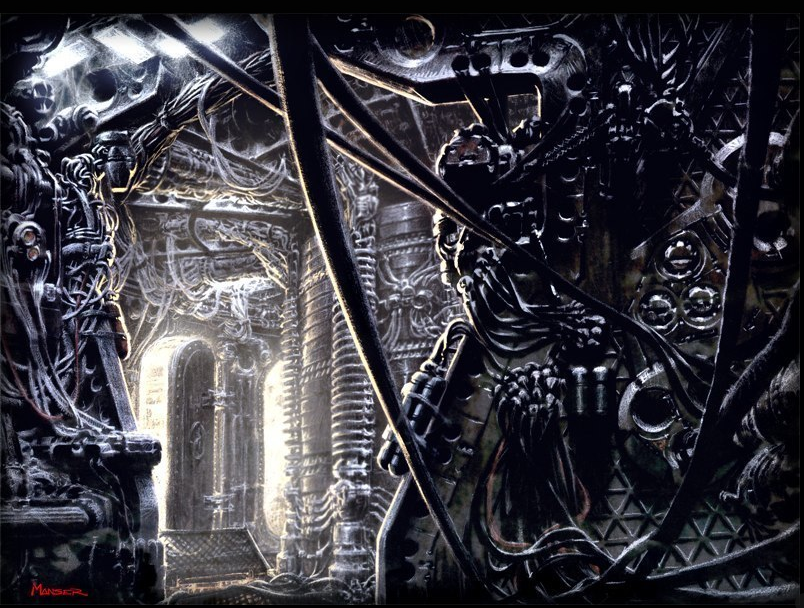 Warren
Manser is another artist who has a huge back catalogue of films that he has
worked on including “Jurassic Park: The Lost World”, “The Matrix” and most
recently “Man of Steel”. He doesn’t have a full time employer because he prefers
to work as a freelance artist, that way he can collaborate with other studios
and companies. He enjoys working in the
industry and has this to say, “It was important to me that I develop
my abilities to envelope a wide range of drawing and painting skills.
Thankfully, I've worked on a variety of projects that never stop challenging me
artistically and creatively.” [4]
When asked what the difference is between concept art and
comic books, Manser said, “It is extremely rare that a concept art piece is
actually seen by the audience, whereas other forms of illustration display a
faithful reproduction of the art piece itself.” [5] Concept art is the
foundations for the project at hand whereas general illustration and comic
books act as the final piece themselves, a visual film in printed form.


